Keywordsai for data analysisBlogai for workai at workworkplace aiai for professionalshow to use ai at workai productivity
Related searcheschatgpt for excel analysisai for kpi commentaryfacts vs hypotheses in ai analysishow to use ai for data analysis at workai spreadsheet analysis without inventing numbersai for data analysis
A model is not a calculator
Data analysis is the place where language models look most competent and fail most quietly. They write a formula that almost works. They describe a trend that is almost the one in the sheet. They recommend an action that would follow if the arithmetic were right. The prose is calm. The error is in the third decimal, or in a total that was never summed, or in a month that was compared with the wrong base. People who would never accept a verbal estimate of a contract value will accept a generated “margin of 23 per cent” because it appears in a tidy paragraph.
This chapter sets a stricter rule than the last. For email and meetings, the risk is tone and commitment. For numbers, the risk is that the model does not calculate. It predicts the next token. Sometimes those tokens look like arithmetic. Sometimes they even match. That is not a method. The method is: the model drafts and explains; the numbers run in a tool you can check — Excel, Python, R, SQL, or a proper BI environment — and you recompute anything you will show a decision-maker.
What follows is how to use AI on spreadsheets without treating the chat as a ledger: why models fail at arithmetic, a sequence that starts from the business question, a four-month sales example, a discipline for keeping observation separate from hypothesis, a reusable prompt, chart choice, and how to take the result to a chief financial officer.
What AI can usefully do with data
Used as an analyst’s assistant rather than as an engine of record, a language model is genuinely useful. It can write and explain formulas. It can propose how to clean and standardise a messy export — dates in three formats, currency symbols mixed with numbers, duplicate customer keys. It can plan the logic of a pivot table before you build one. It can suggest which trends to inspect, which outliers to examine, which KPIs are implied by the business question, and which chart will carry the point. It can summarise a dataset’s shape: row counts, grain, likely keys, missingness. It can generate Python, R or SQL that you then run. It can set out a scenario analysis — what happens to profit if cost rises another five per cent — as a structure of cases, not as a single authoritative number.
None of that is the same as trusting the first figure it types. The division of labour is simple to state and easy to abandon under time pressure. The model proposes the method and the explanation. You, or a tool under your control, produce the number. If you cannot point to the cell, the query, or the script that generated a figure, you do not have an analysis. You have a paragraph.
| Task | Model’s job | Your job |
|---|---|---|
| Formulas | Draft and explain a formula in plain language | Paste it into Excel and check a known row by hand |
| Cleaning | List rules: trim, type, deduplicate, standardise | Apply the rules; keep a log of rows dropped |
| Pivots | Propose rows, columns, values, filters | Build the pivot; reconcile to the source total |
| Trends and outliers | Suggest where to look and why a point looks odd | Confirm the point is in the data, not in the prose |
| KPIs | Map the business question to definitions | Lock the definition; compute it in the tool |
| Code (Python / R / SQL) | Generate a first script | Run it; inspect row counts; keep the notebook |
| Scenarios | Structure cases and sensitivities | Recompute each case; label assumptions |
| Charts | Recommend a type and a title that states the claim | Plot from the checked numbers, not from the chat |
Classify the file before you paste. A public sample is not a customer-level extract. Payroll, pipeline, and unpublished management accounts stay in approved environments. If you need the model’s help on structure, paste a schema and a handful of fake rows, not the live table.
Why models fail at arithmetic
A language model is trained to continue text. When it sees “12 × 15 =”, the continuation that appeared most often in training may be “180”. It may also be “175”, or a plausible near miss, depending on the surrounding tokens. There is no internal ledger. There is no invariant that says the two sides of an equation must balance. Long multiplication, percentages, running totals, and especially chained calculations — growth, then margin, then a comparison with last year — are exactly the operations where fluent error appears.
Three patterns show up in professional work. First, the small sum: a column of four numbers, one of them wrong in the generated total. Second, the percentage: a margin calculated on sales in one sentence and on cost in the next, or a growth rate that uses the wrong base month. Third, the invented precision: “margin compressed by 5.37 percentage points” when the model has rounded intermediate steps inconsistently. None of these is rare. They are the default if you let the chat window be the calculator.
The remedy is not to prompt more sternly (“be careful with maths”). Sternness does not create a calculator. The remedy is to move the arithmetic out of the model. Ask it for the formula, the pandas expression, or the SQL aggregation. Run that. Then, for any number that will appear in a pack, recompute it a second way: a second formula, a pivot that should match the total, a quick sum in a spare sheet. Two independent paths that agree are analysis. One path that came from a paragraph is a claim.
Always recompute in Excel, Python, or another tool you can inspect. If a figure exists only in the model’s prose, it is not ready for a CFO, a client, or a board. Treat generated arithmetic as a hypothesis about the number, not as the number.
There is a narrower exception. Some products now tool the model: they pass the sum to a code interpreter, a spreadsheet plugin, or a warehouse. That is a different architecture. The model is then a router, and the tool is the calculator. Even then, you still read the code or the formula the tool ran. A black box that happens to be correct this afternoon is not a control. The chapter’s rule stands: if you cannot see how the number was produced, you do not own it.
A professional sequence
Amateurs open a file and ask “what stands out?” Professionals start from the business question. The difference is not sophistication. It is whether the analysis can end. A file will always contain another curiosity. A question — “why did profit move, and what should we do before next month?” — tells you when you are done.
The sequence is old. Start from the business question. Check data quality first. Clean and prepare. Explore before you conclude. Run the analysis. Interpret. Form a recommendation. Validate before you act. AI should not jump from raw data to a recommendation without checking quality. If you let it, you will get a confident story about a column that was double-counted, a month that was incomplete, or a cost line that still included a reclassification.
| Stage | Question you answer | What the model may do | What you must not skip |
|---|---|---|---|
| Question | What decision does this serve? | Help you phrase the question tightly | Name the decision-maker and the deadline |
| Quality | Can we trust these rows? | List checks: missing, duplicates, types, grain | Look at the actual file; count rows |
| Prepare | What is in analysis-ready form? | Propose cleaning rules and a data dictionary | Keep a log; do not drop rows silently |
| Explore | What is the shape before we argue? | Suggest slices, charts, outlier tests | Plot; do not conclude yet |
| Analyse | What do the checked numbers say? | Draft formulas, code, comparisons | Recompute; reconcile to a control total |
| Interpret | What do those numbers mean? | Offer interpretations, labelled as such | Keep meaning separate from the fact |
| Recommend | What should we do? | Propose actions and what would falsify them | A named person chooses |
| Validate | Would we still say this tomorrow? | Challenge its own conclusions on request | Independent check of the figures you will show |
Notice the length of that table. The temptation is to skip to “recommend.” Models are built to be helpful, and helpfulness in a chat looks like a conclusion. Your job is to refuse the jump. Quality first is not bureaucracy. It is how you avoid explaining a dip that was a missing week of invoices.
Worked example: four months of sales
Consider a simple management pack. Figures are in thousands of dollars. Four months, three lines: sales, cost, profit. This is small enough to check by hand, which is the point. If a method cannot survive four rows, it will not survive a warehouse.
| Month | Sales ($k) | Cost ($k) | Profit ($k) |
|---|---|---|---|
| January | 420 | 300 | 120 |
| February | 445 | 310 | 135 |
| March | 410 | 315 | 95 |
| April | 512 | 330 | 182 |
Ask the model to calculate growth and margin, flag anomalies, compare months, suggest likely drivers, and recommend actions. Then ignore its arithmetic until you have redone the sums. Sales move from 420 to 445 (plus 6.0 per cent), then to 410 (minus 7.9 per cent from February), then to 512 (plus 24.9 per cent from March). Profit moves from 120 to 135, then to 95, then to 182. Margin — profit divided by sales — is 28.6 per cent in January, 30.3 per cent in February, 23.2 per cent in March, and 35.5 per cent in April. March is the month that needs an explanation. April looks strong; it does not erase March.
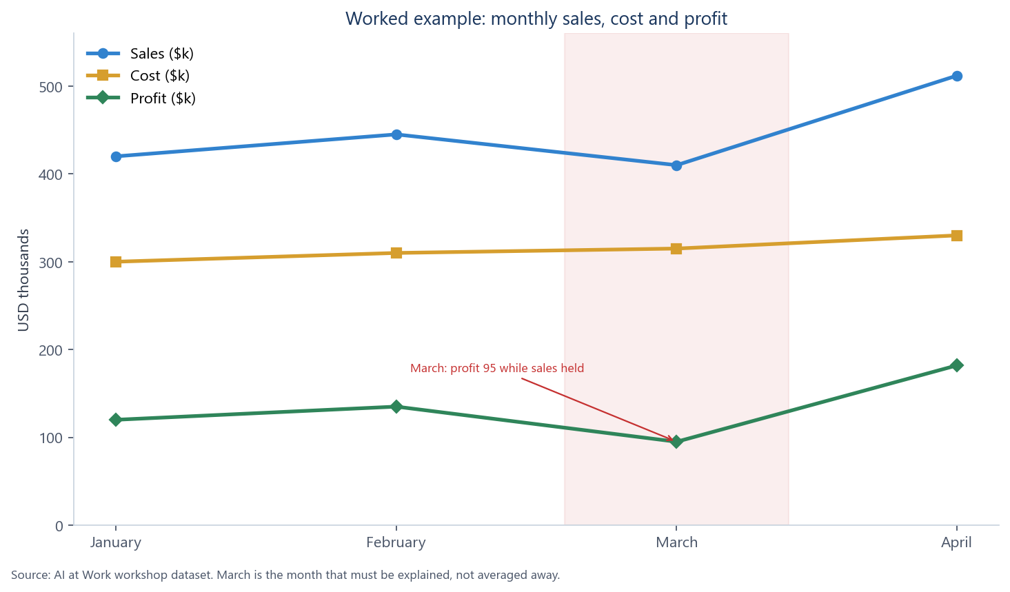
The first chart plots the three series together. Sales dip in March and jump in April. Cost rises every month, including through the March sales dip. Profit is the residual, and it shows the squeeze. A viewer who only saw April’s sales would miss the story. The chart is there to make March unavoidable.
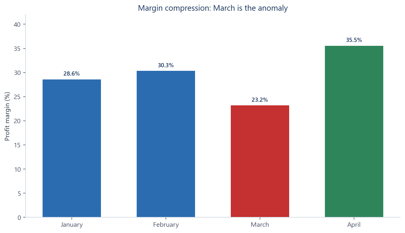
The second chart is the one a CFO will actually use in the first five minutes. Margin, not the raw levels. January and February sit near 29–30 per cent. March drops to a little over 23 per cent. April recovers above 35 per cent. A level chart can hide a mix shift; a margin chart cannot. Cost in March is 315 against sales of 410. Cost is not dramatic in isolation — it is only 15 above January — but it rose while sales fell from February’s 445. That is the squeeze: the numerator of margin fell because the gap between sales and cost narrowed, not because the business “had a bad month” in some unspecified sense.
What should you ask the model, once the numbers live in a sheet you trust? Calculate growth and margin — and show the formulas, do not announce the percentages as gifts. Flag anomalies: March profit of 95, March margin, the April sales step-up. Compare months on a like-for-like basis. Propose likely drivers as hypotheses, not as findings. Recommend actions that could be taken if a hypothesis survives a check against invoices, volume, mix and one-off items. The model is allowed to be useful here. It is not allowed to declare that a supplier raised prices. That is a guess until someone opens the invoices.
Here is a four-month profit-and-loss in $k. Do not treat your own arithmetic as final.

Jan: sales 420, cost 300, profit 120
Feb: 445, 310, 135
Mar: 410, 315, 95
Apr: 512, 330, 182

Give me:
1. Formulas I should enter in Excel for month-on-month sales growth, profit growth, and profit margin.
2. Which month is anomalous on profit and on margin, and why, in one short paragraph of observed facts only.
3. Three hypotheses that could explain March, each with the check I would run (invoices, volume, mix, one-offs).
4. Actions I might take only after a hypothesis is confirmed.
5. What you might be getting wrong.

I will compute every percentage in Excel before I use it.
Observation, interpretation, hypothesis
The March pack is a small laboratory for a distinction that saves careers. An observed fact is a statement that remains true if you disagree about causes. An interpretation is a reading of that fact. A hypothesis is a proposed cause that still needs a test. Mixing the three is how a comment becomes a narrative and a narrative becomes a decision with no evidence under it.
Observed fact: March profit fell to 95 while sales held near 410. That sentence does not explain anything. It is true or false according to the ledger. Interpretation: cost rose faster than sales, so margin compressed. That sentence is a reading of the two lines together. It is still close to the data: cost 315 versus February 310, sales 410 versus 445. Hypothesis: a one-off supplier price increase — to be checked against invoices. That sentence is not in the table. It is a guess about the world. It might be right. Mix, discounts, a delayed shipment of a high-margin product, an accounting reclass, or a short month of billings could also produce the same print.
| Kind | March example | Test |
|---|---|---|
| Observed fact | March profit was 95; sales were 410 | The sheet; the source system |
| Interpretation | Cost rose while sales fell from February, so margin compressed | The two series, and the margin definition |
| Hypothesis | A one-off supplier price increase | Invoices, contracts, volume, mix, one-off items |
Keep the three separate. A fact is not an interpretation, and neither is a proven cause. Models collapse them because a paragraph that contains all three reads as expertise. Your review pass is to split the paragraph back into a list. If a sentence would still be true after the hypothesis is disproved, it is a fact or an interpretation. If it would not, it is a hypothesis and it needs a check. Do not take a hypothesis to a CFO as if it were a finding. Take the fact, the interpretation, and the check you have not yet run.
In any AI-assisted analysis, force three headings in the output: Facts (with cell or query references), Interpretations (labelled), Hypotheses (with the test). If the model resists the headings, the draft is not ready.
A reusable prompt
The following prompt is meant to be copied, attached to a schema or a small sample, and reused. It does not ask the model to be the system of record. It asks for a profile, a quality pass, an analysis plan, and a strict separation of facts from assumptions. Adjust the business question. Do not strip out the instruction to challenge its own conclusions, or the instruction to name what needs independent verification. Those two lines are the control.
You are an analyst assisting me. You do not calculate the official numbers. You propose methods, checks and interpretations. I will recompute in Excel or Python.

Business question: [decision this analysis must support].

I will paste a schema and, if allowed, a small sample — not a confidential full extract.

Do the following, in this order, with headings:

1. Profile the dataset
   Grain, likely keys, time span, units, and which fields look like facts vs derived.

2. Validate quality
   Missing values, duplicates, impossible values, broken types, incomplete periods.
   Say what would make the file unfit for this question.

3. Outliers
   Which points look extreme, by what rule, and whether they might be errors or real events.

4. KPIs
   Propose definitions (numerator, denominator, time window). Do not invent a KPI the question does not need.

5. Trends
   What to plot and what comparison (prior month, prior year, run-rate). Give chart types, not conclusions.

6. Compare segments
   Which cuts (product, region, channel, customer) are implied by the question.

7. Likely drivers
   List as hypotheses only, each with a check against data we do not yet have.

8. Separate
   Facts | Interpretations | Assumptions. Nothing in Facts that is not in the data I provided.

9. Recommend actions
   Only after 8. Each action named with the hypothesis it depends on.

10. Challenge yourself
    What would make this analysis wrong? Where are you guessing?

11. Independent verification
    List every figure, join, and claim that I must recompute or source-check before this leaves my desk.

Output tables where they are clearer than prose. If you show a number, show the formula I should run. If you cannot, write NUMBER NOT COMPUTED.
The prompt is long on purpose. Short prompts produce short-cuts: a narrative that begins at the recommendation. If a particular file does not need segment comparison, leave the heading and let the model say “not implied by the question.” Empty headings are information. They show the step was considered.
Chart choice
Chart choice is not decoration. It is an argument about what the eye should compare. For the four-month pack, Figure 1 (sales, cost, profit as levels) answers “what moved in dollars?” Figure 2 (margin as a rate) answers “did we get paid for the work?” Those are different questions. A stacked bar that buries profit inside a total, a pie of four months, or a 3-D column chart would all make March harder to see. If the model suggests a pie for a time series, decline.
A practical rule: time belongs on the horizontal axis. A rate (margin, growth, conversion) deserves its own chart rather than a second axis that nobody can read in a meeting. Levels and rates on the same axis are how packs confuse a room. If you need both, use two exhibits, as this chapter does. Title the chart with the claim only after the number is checked: “March margin compressed to 23 per cent” is a title. “Margin overview” is a folder name.
When you ask a model to suggest a chart, require it to name the comparison: this month versus last, this segment versus that, actual versus plan. A chart without a comparison is a picture of a table. Also require it to name what the chart cannot show. Figure 1 cannot show mix. Figure 2 cannot show whether April’s recovery is volume or price. Those limits belong in the speaker notes, not in a footnote nobody reads.
Plot from the sheet you have already reconciled, not from values the model typed into the chat. If the chart tool and the model are connected, still export the plotted series and match it to Excel. The exhibit you show is a number with a picture attached. The number has to be yours.
Presenting findings to a CFO
A chief financial officer is not a hostile audience. They are an audience with a short clock and a long memory for numbers that moved. The structure that works is older than language models. Lead with the question you were asked. Give the answer in one sentence, with the figure. Show the exhibit that makes the figure inevitable — for this pack, Figure 2, then Figure 1 if they want the dollars. Separate what you know from what you do not. Then make the ask: a check you need, a decision, or more time.
For March, that conversation might run as follows. Question: why did profit move, and is April a recovery we can trust? Answer: March profit was 95 on sales of 410; margin compressed to 23.2 per cent because cost rose while sales fell from February. We have not yet established the cause. Exhibit: the margin chart, then the levels. Unknowns: price versus volume versus mix versus a one-off versus a booking issue. Ask: two days to reconcile March invoices and mix, before we treat April’s 182 as a run-rate.
Do not open with a generated narrative about “challenging market conditions,” or with a recommendation to “renegotiate supplier contracts,” or with a decimal the model invented. Do not hide April to dramatise March, or hide March to enjoy April. The source is the ledger. The model helped you structure the questions.
| Beat | March pack | Avoid |
|---|---|---|
| Question | What happened to profit, and can we trust April? | A tour of the whole workbook |
| Answer | March margin 23.2%; cost up, sales down from Feb | A story before a number |
| Exhibit | Margin chart, then levels | A pie, or a table of eighteen KPIs |
| Unknowns | Price, volume, mix, one-off, booking | A single causal claim with no check |
| Ask | Time to reconcile invoices before locking a forecast | A strategy offsite as the next step |
If the CFO asks “what does the model think?”, translate. The model thinks in hypotheses. You think in checks. Offer the top two hypotheses and the test for each. That is more senior than a generated paragraph, and it is honest about the tool.
Failure modes on numbers
The failures rhyme with the last chapter, and they cost more. Wrong tone, in analysis, is a casual cause: “looks like suppliers got greedy.” That sentence has no place in a pack. Missing action is a pack that describes March and does not say who will open the invoices by when. Invented attendees appear as invented drivers, invented segments, and invented comparatives — a “usual” margin of 32 per cent that was never in the file.
Arithmetic error is the distinctive failure. Always recompute. Definition drift is the quiet one: margin on sales in one slide, contribution after a half-allocated overhead in the next. Lock the definition in a cell and repeat it. Grain error is the technical one: summing monthly snapshots as if they were flows, or averaging percentages as if they were additive. Quality skip is the cultural one: jumping from a CSV to a recommendation because the model was fluent and the meeting is in twenty minutes. The sequence in this chapter exists to make that skip feel unprofessional rather than efficient.
Data classification remains in force. A four-row teaching example is public. Your live customer file is not. Paste structure and synthetic rows when you want help with a formula. Keep the fact table in the environment that is allowed to hold it. If an approved tool can see the warehouse, use that tool, and still read the SQL.
What this changes in the week
Used this way, AI shortens the distance from a question to a plan of analysis. It does not shorten the distance from a plan to a true number. That distance is still Excel, Python, a warehouse query, and a human who will put their name on the pack. Scale the four-month loop — question, quality, compute, separate fact from guess, chart the rate and the level, walk in with an ask — and do not skip steps as the file gets larger. Draft with the model. Calculate in a tool. Verify before you act.
Key takeaways
- AI drafts formulas, cleaning rules, code and chart choices. The numbers run in Excel, Python, R or SQL — in a tool you can check.
- Models fail at arithmetic because they predict tokens; they do not keep a ledger. Always recompute.
- Start from the business question. Check quality before you explore, and do not jump from raw data to a recommendation.
- In the four-month pack, March is the month to explain: profit 95, sales 410, margin compressed. April does not cancel that work.
- Keep observation, interpretation and hypothesis on separate lines. A fact is not a cause.
- Show a CFO the question, the checked number, the exhibit, the unknowns, and the ask. Do not show a generated narrative.